

(via here)
Despite the constant presence of email in my life, I still consider hand-written correspondence to be one of life's most important small luxuries. Taking time to write a note, place a stamp on it and send it via the USPS has taken on a strange old-fashioned allure these days, and I am always touched when I receive a well-penned letter in my mailbox -- it feels like a small gift.
A few years ago, I splurged on a supply of Smythson die-stamped personalized correspondence cards and it proved to be one of the most rewarding purchases I've ever made. I chose a pale green-blue color called "Three Crowns" for the paper and had my name engraved in bright red ink. The envelopes were lined in matching red tissue for an extra little surprise upon opening.

Using such precious stationery had the surprising benefit of causing my thoughts to rise to the level of the paper they were written on. Before Smythson (B.S.), I sometimes wrote hastily and without forethought; after Smythson (A.S.), by the time I touched ultra fine point Sharpie to watermarked card, my handwriting was neat and my points were pithy.
So here's what I'm considering now: house stationery.
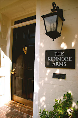
When we moved to our present home in 2007, we had this slate sign fashioned so our friends and neighbors would know they were always welcome to pop by for a pot (of tea) or a pint (of beer). After all, what's life without a bit of cheeky humor? I'm all for adding a bit of personality to your dwelling. (Live in a top-floor walk-up? Call it "Clouds." Basement studio? Dub it "Down Under.")
Seeking ideas for page layouts, I wondered what kind of house stationery Bloomsbury luminaries such as Virginia Woolf or Lady Ottoline Morrell chose for their personal use and if any examples of it still existed today. Believe it or not, after a brief search, I found them on the Smith College Library website.
I provide them here for inspiration...
1. I like the two-pronged header of Virginia Woolf's Hogarth House stationery...and doesn't it make you wish that telephone numbers still had word prefixes?

(Detail, letter from Virginia Woolf to Katherine Mansfield, 13 February 1921)
2. Here's Lytton Strachey's personal stationery. Love the font...of course, it helps if you get to use words like "Pangbourne" and "Tidmarsh."

(Detail, letter from Lytton Strachey to Virginia Woolf, 9 October 1922)
3. This version of Virginia Woolf's stationery from Monk's House uses an elegant italicised script. I like the "near Lewes, Sussex" part. I suppose I could put "near Hollywood, California" on mine.

(Detail, letter from Virginia Woolf to Robert Spirra, 27 February 1929)
4. This stationery from Lady Ottoline Morrell's country house was available in all the guest rooms and replete with information, including the nearest train station (a chic idea for New Yorkers and other city dwellers).

(Detail, letter from Lytton Strachey to Virginia Woolf, 17 July 1916;
written 0n Lady Ottoline Morrell's house stationery.)
5. I love, love, love the art direction for Lytton Strachey's Hampstead home. That slanted telephone number is so arresting.

(Detail, letter from Lytton Strachey to Virginia Woolf, 17 February 1909)
6. Apparently, Virginia did too. Here's her London townhouse stationery three years later.

(Detail, letter from Virginia Woolf to Lytton Strachey, 6 June 1912)

25 comments:
Did you know that Paradise Road, Richmond, is now the home of the HQ of Mills & Boon, publishers of heady romances? It just seems kind of appropriate.
You do write the most wonderful posts, I love these examples! I also love writing and receiving letters from a few bookish friends. My writing paper is fairly boring recycled paper from WH Smith, but I did splash out on tissue-lined envelopes because I have a secret love for them...
m: Didn't know that. I wonder how close it is to Hogarth House?
Stuck-in-a-Book: Oooh, it's all about the tissue-lined paper. Once you go there, there's no going back!
wonderful post! thank you.
I do so agree! You should definitely splurge on house stationery. Perhaps I should as well. Let's see...how's From The House of Edward sound to you?
Wouldn't you have loved to receive a hand-written note from Virginia?
Oh my heavens, I absolutely adore this post! I have a bit of a stationery fetish myself, but this is just beyond. I really love the idea of the slanted phone number and train station printed at the top. It is quite useful, as well as whimsical. You must show us what you ultimately decide on!
I feel so honored to have one of your notes.
There is no other feeling in the world than that of a hand written note, be it fancy or some old scrap.
I fancy any sort of scribble.
pve
Yes you can't go past Smythson. Their colours are very modern so that contract works very well. As it happens I have some 'house stationery'. I has our name, address and what I think is a large oak tree engraved on the middle top. We got it from a printer in Venice of all places (Gianni Basso in Canareggio). He is not exactly a hidden secret (he was in a guide book) but I am certain that 6 years later he still doesn't have a website, or twitter, or probably even a mobile phone. So what I am saying in a roundabout way is that the address is obviously critical but it is nice to have a little (dateless- choose carefully) image as well. !!... xoxo
Mickey: You're welcome!
Pamela Terry and Edward: I think your idea is divine and you should do it IMMEDIATELY. And re: hand-written note from Virginia, I'm reading Book two of her "Letters" compiled by Nigel Nicolson and yes, yes, yes, to have been on the receiving end of one of her floating pieces of prose would have been quite an honor.
Laura: I know, I seriously love that slanted number too. Come on, do it...take the typesetting plunge!
PVE: I am equally honored to own your artwork. :}
Jane: First of all, your stationery sounds seriously beautiful. And I agree with you that address-less correspondence can be used forever and is really the practical way to go. But I'm ready to commit to some with my house name on it...and if we should (gasp) move before I finish all of it, I'll pass it on to the new owner!
ooh! I love the post on the stationary but I am equally in love with your pithy ideas about house naming. House naming is an old tradition in our family, but I've yet to find the one that "sings" for the home we're in. New, only moved in one and a half years ago. Number 138, Terrazzo Lane, in Napa Valley. Sounds romantic enough, but is it singing? Can't put my finger on it. Any thoughts?
Kate: I'm thinking, I'm thinking...
Love It! What a great post. Seriously, who doesn't love stationary?! Everything about it, from the ritual of sitting down and writing a letter, to the stamp, to the mailing. Then receiving a letter, reading it, feeling special. Picking out your style of paper, font etc... the whole experience is just divine. And I LOVE naming houses, my blog name is actually the name of our beach house... it's the house that got me started in this whole blog world. Fabulous post!
The more something becomes commonplace (such as e-mail), the more the harder to come by (snail mail on beautiful stationary) becomes a such a gift. Even my letter carriers (really more catalog delivery people) smile when they hand me a first class, hand-addressed letter (not an invitation, or a notecard, but a genuine LETTER). I know you are focused on the stationary, but the handwriting really speaks to me.
And to PT&E: I'd love to receive a hand-written note from Edward!
Thank you Lisa. It's about time that someone writes about the merits of old fashioned letters. Lytton Strachey once wrote, "The Masterpiece is in the hand of the postman". It's so interesting to see how different Woolf and Strachey hand-writings are. Have you ever seen Lady Ottoline Morrell's handwriting? She had the most beautiful handwriting I've ever seen. It's so artistic and refined. I first saw her handwriting in her 2 volume memoirs and I fell in love it.
I completely agree with you about the importance of beautiful stationery. Oh, and beautiful pens, too. I have a bit of a thing for fountain pens.
I LOVE the stationery that Strachey used at his Hampstead home. A lot of the research my husband does on Bloomsbury involves reading their personal correspondence. In fact, reading through the collection of Desmond and Molly MacCarthy's letters at Indiana University's Lily Library was what inspired him to study the Bloomsbury Group in the first place. He later went on to curate an exhibition on Bloomsbury at the Lily and to write a small accompanying book about the MacCarthys. I mention this because I often wonder what scholars will have to look at when studying the lives of many writers and artists of today. Emails, yes, but a huge part of the research really is about the personal touches like the stationery chosen, the writing style, the little drawings in the margins, etc. Enid Bagnold's letters to Desmond MacCarthy are full of gorgeous drawings. Such a delight to see and read.
Thanks for a fabulous post! We are living/writing for the fall on an island off the coast of Maine in a little cottage called "Whitecap." You have inspired me to make up a small amount of Whitecap stationery for the letters I'm writing to friends while we're here. Thank You! xo
This makes my stationer, one time Seven Sisters student, Virginia Woolf-loving heart beat off course.
LISA-
These are great.
Now...pen and ink required and literary allusions all around.
I like the simplicity. They're unpretentious. Makes you think you should not ruin the design with an email address...and definitely not a 'cell phone' number.
I think the question is: 'What would Virginia do' or 'What would Vita do'...
...you will make it brilliant.
Happy days, www.thestylesaloniste.com
Several years ago my partner gave me a load of beautiful Smythson stationary in two different sizes. Try as I might, my handwriting is somewhat embarassing and I felt like I was defiling the beautiful paper with my scratch. As a result I didn't use much of the stationary. Recently I figured out how to get the odd size paper (for the US at least) to work in my printer. Since it is a color printer I use a sepia color for my name and home address block in one font and use regular black in another font for the body of the letter. It isn't engraved, but it sure does look nice. And I use my stationary much more than I would if I just had to rely on my handwriting.
the sweet life with olives: what a beautiful name for a house!
home before dark and A Super Dilettante: I agree, the handwriting is JUST as important as the stationery. I must search for an example of Ottoline's penmanship...
Gigi: You bring up such a fascinating point about future generations studying the writers of today. I wonder if they will be handed computer files of first drafts and abandoned novels...it's not quite the same, is it?
And how magical your cottage off the coast of Maine sounds! Do have the stationery printed up...you will write the most wonderful notes on it...Long live "Whitecap"!
Jezebel: I live to make your heart beat off-course. :) Still get so many comments on your ant necklace, btw...
Diane: If only we could reach out and ask V and V their opinions!
Thomas: My aren't you are the clever lad? I quite admire your ingenious idea...may have to try the same thing myself... merci, my dear... xx
What a great post! I'm going to borrow the idea of adding the nearest train station to my stationary -brilliant!
You know, since the dawn of e-mail
I have hardly received any handwritten correspondence apart from my parents and in - laws, who still(!) do not have a computer!
They live the charming, classic life with written letters, reading books at home and enjoy local pleasures...
Anyways, most others are invitations, often too elaboratly done for the occasion.
I've had stationary made by Crane a few years back and so enjoy writing on them, thanks to a large family oversees.
But yours is beautiful and I'll consider....
Aren't those letters lovely?
I have such a soft spot for Virginia and Vanessa!
When I see this kind of information posted It encourages me to keep on doing research for more similar issues.
We love your terrazzo and we want to see it come back to life.Cleaning Terrazzo Fort Lauderdale is our specialty and has been for over twenty years. We have state of the art equipment and knowledgeable technicians. Call us today for a free estimate.
Hello.. Firstly I would like to send greetings to all readers. After this, I recognize the content so interesting about this article. For me personally I liked all the information. I would like to know of cases like this more often. In my personal experience I might mention a book called Green Parks Costa Rica in this book that I mentioned have very interesting topics, and also you have much to do with the main theme of this article.
Post a Comment